Signs
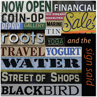
We are bombarded with signs everywhere we go. Even out away from urban areas, depending on where we are, we see billboards and directional signs, town signs, animal crossing signs, construction ahead signs, points of interest signs.
I’m old enough to remember Burma Shave signs. They would advertise their shaving cream with four or five signs in a row alongside the highway (not expressway, just regular rural highways), and it would be something like: sign one “don’t try passing…” sign two “….on a slope” sign three “unless you have a…” sign four “…periscope”. The final sign would be the “Burma Shave” logo. I used to look forward to seeing those, which they spaced about three hundred feet apart, so you had time to look for the next one in the series while driving 55 mph.
There have been some unfortunate font choices for signs leading to some hilarious, but unfortunate-looking phrasing, which most of you have probably seen samples of on the internet, so I won’t bother to post those here. However, sometimes you wonder what someone is thinking when you pass a truck, and the font is tall and narrow and thin and you can’t quite figure out what the heck the name of the company is. Sometimes I feel like calling the number on the truck under the phrase “How’s my driving?”, and asking “who the heck designed your logo?”, but I never would actually do that. That would, of course, be odd.
There’s a trucking company called ABF, and their trucks usually have the company initials three times in a row on the back or the side of the truck, and every time I see one, because of the particular font they picked, I think of a dog barking. To me it looks like “ARF ARF ARF”. Although that’s just me….at least their logo IS legible.
The “JEWELRY SPORTING GOODS” sign here I found on the side of an empty building in Port Huron, Michigan and I was amused by the juxtaposition of odd sales items. At least they had the text on two lines for some kind of visual separation.
It does remind me of one time in O’Hare airport in Chicago when we were in the lower level of the airport renting a car. While my husband was filling out the paperwork, I happened to look up and saw:
INFORMATION
POLICE
It was above a doorway next to the rental car counter. Obviously, being stacked on two lines made it clear we were talking about two different things, but the effect was kind of Orwellian. I mean, well, use your imagination here.
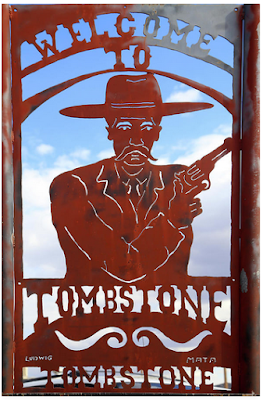
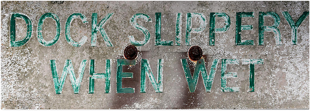
In the meantime, some people are drawn to signs because of a nostalgic connection, like the Brass Rail bar sign, or Lamy’s Diner, places where people gather to have a meal or a beer after work. I have just recently started “collecting” signs, and it’s fun to see how many varieties, colors, and kinds there are, old and new. Rusted or faded, they are still fun to look at if you take the time.
For more of my images, please visit:
mary-bedy.pixels.com



Some great stories about signs - there used to be a pub (bar) in the UK that I drove past at least once a week and they had a chalk board outside where the landlord wrote jokes about various things that were in the news that always made me smile. I particularly like your 'D.Dupont Barber' sign.
ReplyDeleteThanks, Dorothy. I thought it was a cool old sign. I don't know if it's been restored but it's from Fayette State Park in upper Michigan which used to be a small old iron smelting town. I love old signs :-)
Delete